
Best minimal website design examples

This blog post is a little different. We have compiled examples of our favourite minimalist websites for you to have a peruse. For each one we explain why these have been chosen, and for some, based on which minimalist principles.
These minimal website examples are taken from either a higher end market, or from very successful and well known businesses, but we can learn from them and understand just how their elegant and clean layouts have benefited them.
As you go through them you’ll recognise most, if not all of them.
Disclaimer: The following designs are not ours and we take NO credit for them! They are just examples that we’ve found and loved from Google searches.
Free Workbook
Before you read on, let’s make you aware of the free 10 page workbook that we wrote, for our users to download, read and complete. In this workbook, we will run through the basics of minimalist website design. You get to put a step by step plan for your own website into action using our workbook. Click the ‘download’ button below for your copy.

Minimal Website Examples
The Apple Website (Apple.com)
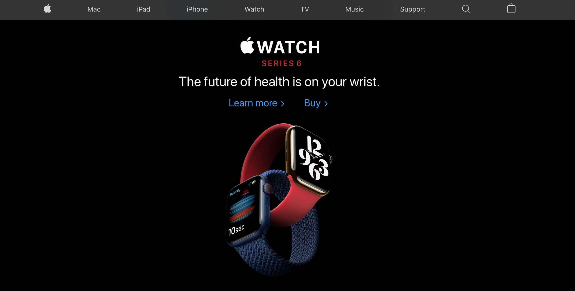
Apple.com
You have definitely heard of this famous brand. We have no doubt about it, and if you haven’t, well then we want to hear from you!
The Apple website has done a fantastic job at creating a large amount of white (or blank) space. This gives the user very little choice at what to look at on the page. The content is clear and directed with purpose. The primary calls to actions stand out, because there is no clutter on the page, or content which isn’t relevant.
White space
Calls to actions
Clutter free
Beautiful and impactful images of latest product(s)
Clean layout

Apple.com
The Tesla Website (Tesla.com)

Tesla.com
Tesla is a high end, futuristic brand, promoting a cleaner environment. This is all reflected on their website. The site provides a wonderful user experience, and appeals to the ideal clients very well.
Clean layout
Calls to actions
Beautiful and impactful images of the latest model(s)
White space
The WhatsApp Website (Whatsapp.com)

Whatsapp.com
This website has done a great job at capturing its unique niche and showing this is on their tagline. The homepage is not huge, and not packed full of unnecessary imagery, text or anything fancy. Personally, we love this homepage!
Clean layout
Calls to actions
Clutter free
White space
Minimal primary navigation links
The Skype Website (Skype.com)
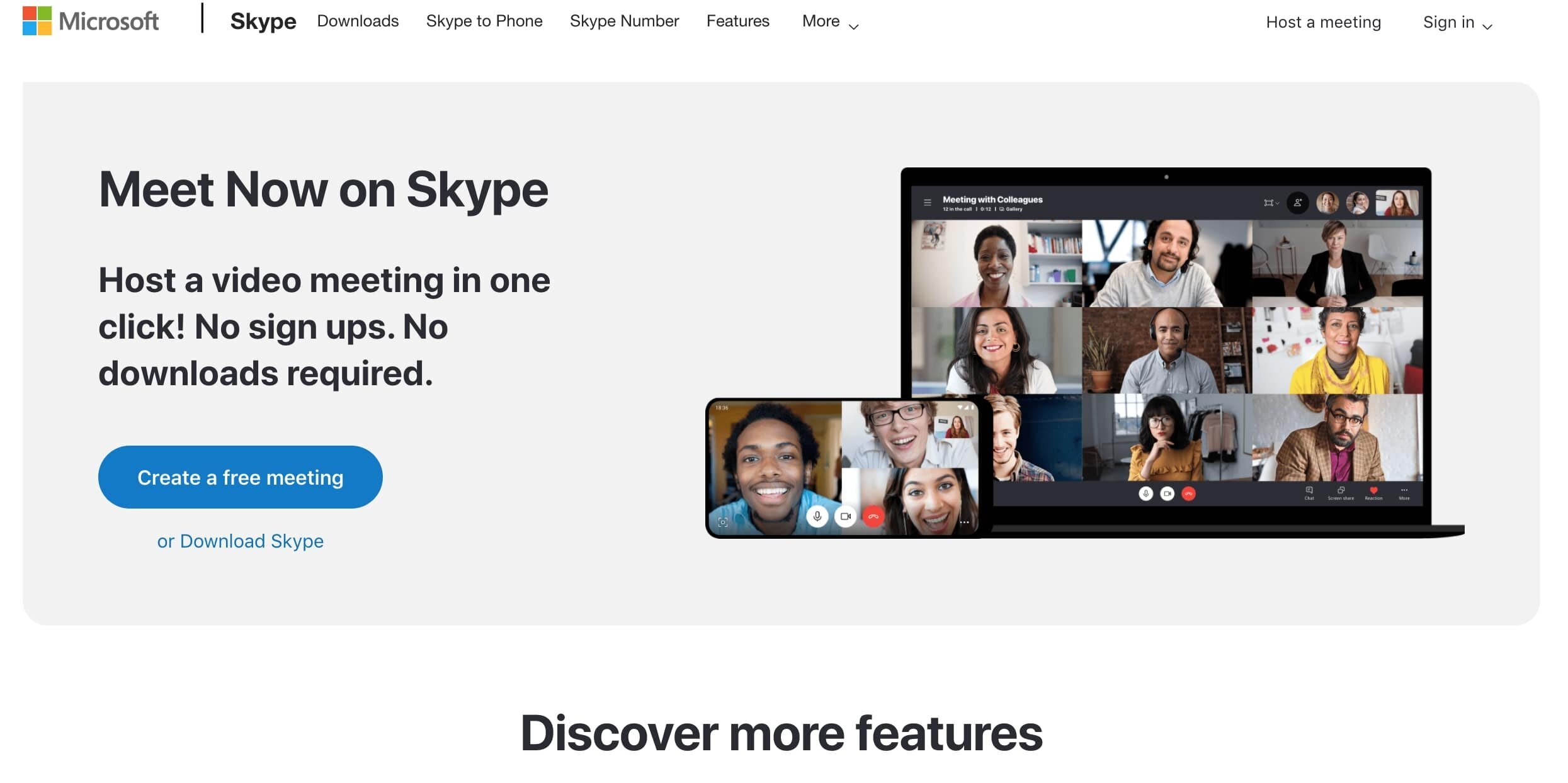
Skype.com
This is another great example of a homepage which isn’t too long in its length and is only broken into a few segments. The content gets straight to the point, which is one of the main concepts of minimalist design.
White space
Calls to actions
Clutter free
Imagery relevant to the content
The Google Website (Google.co.uk)

Google.co.uk
Now … what can we say about the Google homepage!? We LOVE the Google homepage. It is such a beautiful example of a clean, simple but completely effective homepage layout. There are two calls to actions on the Google homepage, well you could argue it’s just the one .. which is for the user to start typing something in the search bar.
Call to action
White space; plenty of it
Clutter free
Minimal primary navigation
Clean layout
The Haagen Dazs Website (Haagen-dazs.co.uk)

Haagen-Dazs.co.uk
This homepage is segmented really nicely, with beautiful images of the products, which are also aesthetically very pleasing. The tagline is very catchy, and will appeal nicely to their ideal customers. Even the footer navigation is kept minimal with the important, but less exciting stuff.
Minimal primary navigation
Clean layout
Beautiful imagery
White space
Clutter free
Calls to actions
The Ferrari Website (Ferrari.com)

Ferrari.com
This website is amazing with beautiful imagery of very high end cars .. I mean Ferrari .. need we say more?
The site is kept clutter free, with the opening of the homepage instantly creating the ideal user experience. They have also included a video as the second segment, again which creates a great experience for the visitor, this also leads to a call to action.
Beautiful imagery/videography
Clutter free
Calls to actions
White space
Minimal primary navigation
The Takeaway ..
All of these websites definitely have a recurring theme and several aspects of design in common. They all have calls to actions which are either displayed as buttons or are clear on the homepage. They all know exactly who their ideal customers are, and how to appeal to them by creating an experience the visitors will remember.
White space is key to minimal design strategy which is proven throughout all of the above examples, and is one of the common factors of the designs.
Inspiring
The above examples, and more minimal websites which we haven’t mentioned in this post, continue to be inspiring for us and hopefully come through in our current and future portfolio.
Free WORKBOOK
Now, if you’re interested in learning the basics behind minimalist design, we have created a free 10 page workbook for you to download, read and work through for your own minimal website design purposes! Get it below …