
How to make a fixed header in Squarespace

Squarespace enables sticky navigation bars for mobile website design. It is so important to ensure a mobile optimised website, and sticky, or fixed navigation bars/headers are becoming more and more popular in web design strategies. So, let’s run through the benefits and see some examples of Squarespace fixed headers.
Throughout the post we’ll refer to the Squarespace fixed header as either ‘sticky navigation’ or ‘fixed navigation’ too. But hopefully you get the idea.
Sticky navigation is known to be good for content heavy sites (which we will never promote!) but is still a great option to have in minimally designed websites for mobile phone users.
So What is ‘Sticky Navigation’?
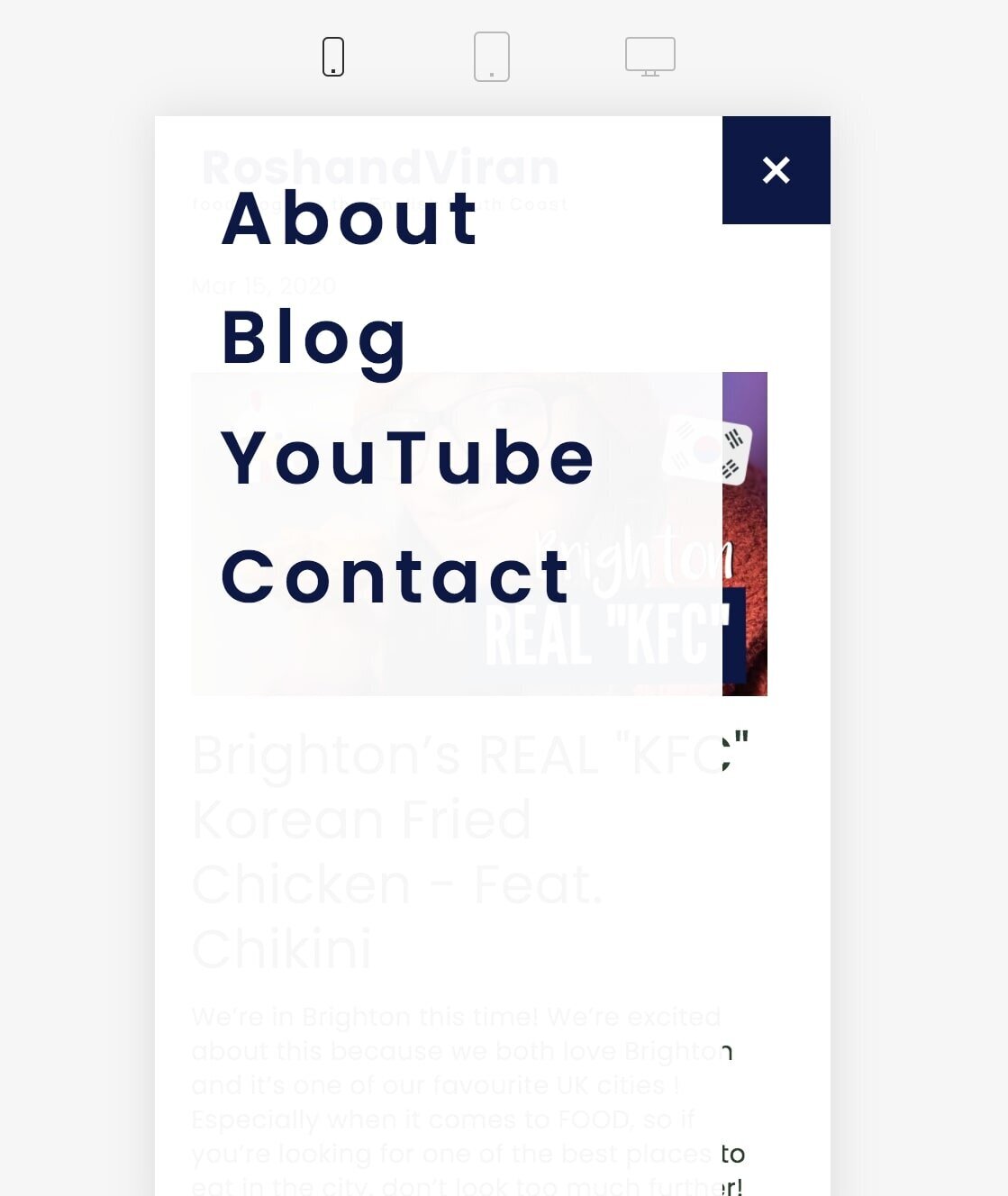
As you scroll down the page, this is the navigation bar staying fixed on the page. Here is an example …

Squarespace fixed header
As the above shows, the primary navigation bar stays visible and in a fixed position on the page, as the user scrolls down. So it is always visible and easily available to them.
What are the Benefits?
The benefits are big for mobile usage, especially since the number of people visiting websites on their phones is increasing all the time. This is because when scrolling through sites on a mobile, users may need more reminding as to what the next stage is along your website roadmap.
Fixed, or sticky navigation bars set a good reminder for the next intended call to action (CTA).
The following are great benefits of sticky navigation:
Reminds users of the next intended action
Improves user experience
May reduce bounce rate and increase visitor conversion
Ideal for longer page scrolling and not having to rely on ‘back to top’ links
May benefit a specific demographic such as older adults, or much younger users
Gives the user the feeling of more control
Especially great for smaller screen (mobile) viewing
Sticky navigation has been found to be especially beneficial for ecommerce and retail websites for some of the above reasons; the next action to take is at the user’s immediate disposal. Where in most cases ecommerce businesses have seen increases in conversion by about 3%.
Squarespace Fixed Header
Example
Like below, the primary navigation/header stays on the page. This way, there is a much greater chance that the visitor will follow the next stage on your website roadmap.

Squarespace fixed header
Squarespace fixed header
Website Goal & Roadmap
You keep hearing us talking about the website roadmap! We have a whole other blog post on this, where we talk about the best way to create a roadmap based on your website goal(s).
Your primary navigation is designed to be aligned with the website goal(s) which you set, and so having this fixed on the page increases the chance of your site achieving what you need for your business. This takes us to talking about the purpose of your primary navigation.
Purpose of Primary Navigation
Align your site with your site goal(s)
Presents your users with the right CTA(s)
Lists the most important pages of your site very obviously to the user
User Psychology
A sticky navigation bar gives users the feeling of having some control. This is because they know what their options are whilst scrolling and looking at the other content on the page.
One of the biggest advantages of minimal website design is to keep the website pages clutter free. When you combine this with a fixed navigation on mobile usage you’re providing your visitor with not only a much cleaner website, but also a better user experience.
Users don’t want to feel lost and confused when it comes to visiting websites. Although in minimal web design, we encourage businesses to keep their pages shorter rather than too long, a fixed navigation can help people feel more comfortable, and stop them from reaching a ‘stressed’ point!
Sticky Design
The examples which you saw above, are taken from our Squarespace designed sites. Squarespace does a great job at supplying a good sized fixed navigation bar for mobile phones. Due to users having to view your site on a much smaller screen, Squarespace understands the importance of having the sticky navigation present, but doesn’t destroy the user experience for the rest of the site’s content.
