
Why minimal and clean web designs convert better
Minimalist website designs are quickly growing a lot of interest. The simplicity and cleanliness of the layouts can have so many benefits. One of the many is the fact that minimal web designs give a much more professional look to the overall design, therefore making your site a lot more appealing to visitors.
Happy visitors means they’ll stick around longer, which ultimately leads to better visitor-sales conversion.
The key is to make sure that your core business information is captured, but at the same time ensuring that the design is kept clean, minimal and beautiful.
Main REASONS
So what are the main and best advantages of a minimal website design:
The ability to load faster due to the reduced number of photos and graphics.
Less clutter on the pages.
Less confusion and overwhelm by website visitors.
Are aligned with your business and website goals.
Better site flow for visitors; visitors know what to click/visit next therefore, more of an intuitive experience.
Less choice offered to visitors; this is a good thing, more on it next.
Better user experience.
Less is More ..

Google.com
If there is one design we need to think about when it comes to an amazing user experience, that is the Google search page. Ask yourself, “what are they wanting me to do here?”. The answer is “one thing, and that is to use their search engine”.
No confusion and no other choices, just a clear call to action which is in line with their business’ site goals.
By limiting the amount of choice for your website visitors, you are helping them focus on the actions you want them to focus on.
Studies have shown that people love choice, because then the visitor feels like they are in control. However … the more choice, and the less effective your website becomes.
This is because it has been shown that when people are presented with too many choices, they are less likely to actually make a final decision.
This is completely the opposite of what we want out of a minimal website design, and for any business in fact.

Choice Paralysis
The jam experiment is a famous study which has shown that when a person is presented with too many choices, they are less likely to come to a decision.
In this experiment, consumers were presented with one stall selling 24 jars of jam, and another selling only 6 jars. During psychology talks, when people are asked which stall they would stop at, they almost always answer favouring the stall with 24 jars.
However, a study by Psychologists Iyengar et al, had shown that when it came to actually purchasing the jams, 3% bought from the stall selling 24 jars of jam. In comparison to 30% buying from the stall selling 6 jars.
When people are presented with too much choice, there is a sudden fear that we cannot come to an informed decision. Leading to no decision at all.
More choice also means that more time and effort is spent on trying to come to a final decision. This can produce feelings of stress, anxiety and pressure. Again, leading to no final decision.
Faster Loading ..
By not including unnecessary graphics and images on your pages, the site’s loading speed will improve and in turn making the visitor’s experience a lot nicer.
Including more images hurts loading speeds, but also another trick is to keep file sizes small. Which is another aspect of minimalist web design, but also good design practices in general. We don’t want to lose photo resolution but at the same time don’t want to slow things down.
This can especially be annoying to visitors when using mobiles and tablets to access your website. As the demand increases for websites to be seen on mobile phones, it is so important to optimise website designs for mobiles.
With a minimal design strategy, as the number of photos and graphics are kept to a minimum and small in size (kB), this is very favourable for many businesses today.
Less Clutter, Less Confusion ....
With a minimalistic design, you’re not including any unnecessary content within a particular page, that can potentially be added somewhere else (if you decide you still want it).
Before adding content to a page, ask yourself:
Does it really need to sit on this page?
Do the important links stand out?
Can it be moved to the footer of the homepage?
If the page is left cluttered, then the visitor is left confused with the sheer number of options to choose from, or images/graphics to look at.
Basically, there is no breathing space (Why Your Website Needs White Space) for visitors. White, or blank space, is a fantastic method within minimalist design to help achieve a better user experience.
Example Time..
For example, take the homepage of your website (here’s a link to a more detailed post). The main idea here is to draw the visitor in, and make sure they don’t leave your site.
For this reason, you want to include only between 1-5 of your best photos of either the product, office, team or whatever is most applicable to your business.
Text should be limited to your unique niche (what is different about you, and what client type fits this niche), as well as a small primary navigation bar.
You also need to ensure that you include only the Call To Actions (CTA) which are aligned with your site goals (a sale, completion of a contact form, etc).
To be honest, anymore than this is heading into ‘clutter’ territory.
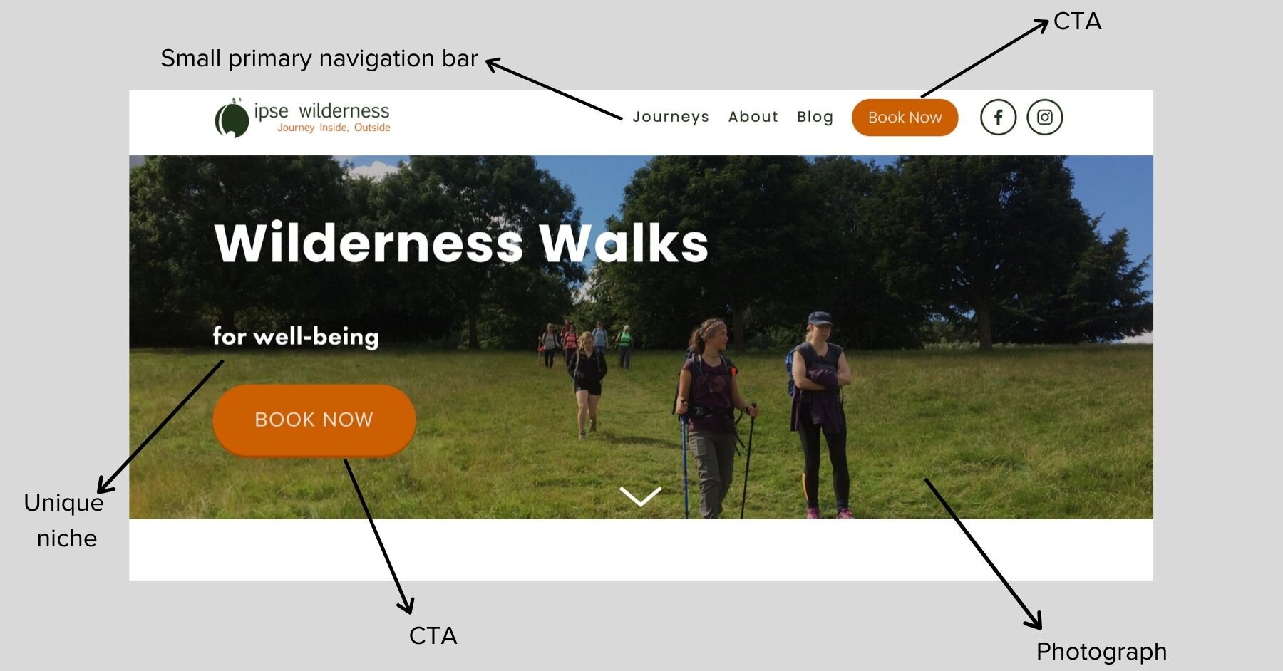
This is an example of one of the Original Box designs, of IPSE Wilderness Walks programme. You will notice that both CTA buttons lead to the same page (booking page).
There are no more than 6 links within the primary navigation bar including 2 links to social media pages. The unique niche is made very clear on the top of the page, with a photograph from one of the walks to give a better idea of what the business does.
Intuitive Experience
Whatever your business is about, the point of a minimal web layout is to ensure that your ideal client type knows where to click next in order to achieve the action that they want.
Minimal website designs do not offer the visitor too many clicks or steps in order for them to get to the desired location. Whether this is to purchase a product or get to a contact or enquiry form.
It’s all about the user experience and improving it, and that is the point of a minimal layout.
This is also why before building a minimalist site, it is important to define a clear website roadmap, going from the homepage to where you want your visitor to finish.
Better Conversion
Simplistic and clean designs will always convert better. We can think of some famous brands with beautiful and minimal websites such as Apple and Tesla, that are leading the way compared with their online competitors.

Tesla.com
Minimal web designs improves the overall user experience. Studies have shown that visitors stay on a homepage for an average of 8 seconds, and it's within this time that you need to make a good first impression.
By keeping your site clutter free, with increased white space and with limited choices, visitors are less likely to become overwhelmed by unnecessary content.
Break down large tasks or pieces of information into smaller, easy to read sections, and remind visitors of key actions rather than letting them rely on their own memory.
Just like an uncluttered and easy to navigate physical store, a clean and minimal website is going to perform much better for your prospective clientele.
Minimal Designs for Every Business
You may be thinking that reducing the amount of choice for your website seems near impossible.
For example if you’re an ecommerce business, and the number of products you sell contradicts the limited choice concept. To be perfectly honest and in such cases it is not always possible to reduce the amount of choice, but there is the opportunity of conducting some user testing and research here.
This is a whole other topic to discuss, but the main questions to ask are:
What are your user’s requirements?
What do they need in order to help them find the right product for their needs?
How can such requirements be translated into an intuitive website roadmap?
Even as an ecommerce business, you can build a beautiful and clean website. This is done by including as much blank space as possible in between content, decluttering the page to be free from irrelevant content and, keeping CTAs clear and not hidden away.
An example of this is below, where you can see that plenty of white/blank space has been left in between the products, and the page doesn’t contain any unnecessary content.

Minimal Websites & Better Sales
The take away from all of this is that with a minimal web design strategy, entrepreneurs and businesses can rely on their websites to be self-sufficient because of all of the advantages that the simpler layout brings.
Reduced choices on a page means better focus by potential customers and consumers.
Reduced clutter on a page means less overwhelm and confusion, so visitors stick around longer.
Important links such as CTAs are made clear on the page, and visitors know where to go next.
Your business’ unique niche stands out on the page, attracting your ideal clientele.
Overall a much better user experience.