
Why your website needs white space?

Not always white
The concept of white or, blank space in minimalist website design is one of the most popularly used. In this blog we delve into the best reasons to use white space design, all in the name of creating a beautiful and slick website.
Just as a FYI - white space doesn’t have to be white in colour!
Not sure if there is any surprise there but when we refer to ‘white space’ in web design, we mean ‘negative space’, or basically any space within the page that is left blank. Simple. Right?

White Space is not always“White”
What are the advantages of white space
Space that is left untouched in between the various elements of a website, provides a nice, sort of visual breathing space before the visitor has to move on to the next section.
Negative space gives an easier flow on the eyes when scrolling, which then means that visitors are able to focus their attention on only the most important aspects of the site.
improves user experience
White/negative space improves user experience by helping visitors navigate the page better, because by inclusion of blank spaces in-between content increases its legibility.
Your website visitor will be less distracted by too many things cluttering the page, and in turn focus is directed to where you want their focus to go in the first place.
Of course you can make Call To Action (CTA) buttons, images and text, large enough, to help bring more visitor attention to them. However, by inclusion of enough white/blank space in-between your content, you’re able to produce this effect without unnecessarily needing to increase the size of anything.
Elegance and Style
Space that is left blank in-between the various elements of your website, can also add a form of elegance. When we think about some of our favourite websites that are leading the way in their online industries, it's the grace and style of their layout that we absolutely love.
Don’t get us wrong, there is such a thing as adding too much negative space and making it look as if there is no content whatsoever. The key is to have the right balance between your content and the blank space in-between it.
Examples
Here are some examples of high end websites that we call elegant, stylish and slick. It's clear from these that even if referred to as ‘white’ space, the colour of such spacers are irrelevant and completely dependent on your own website design.
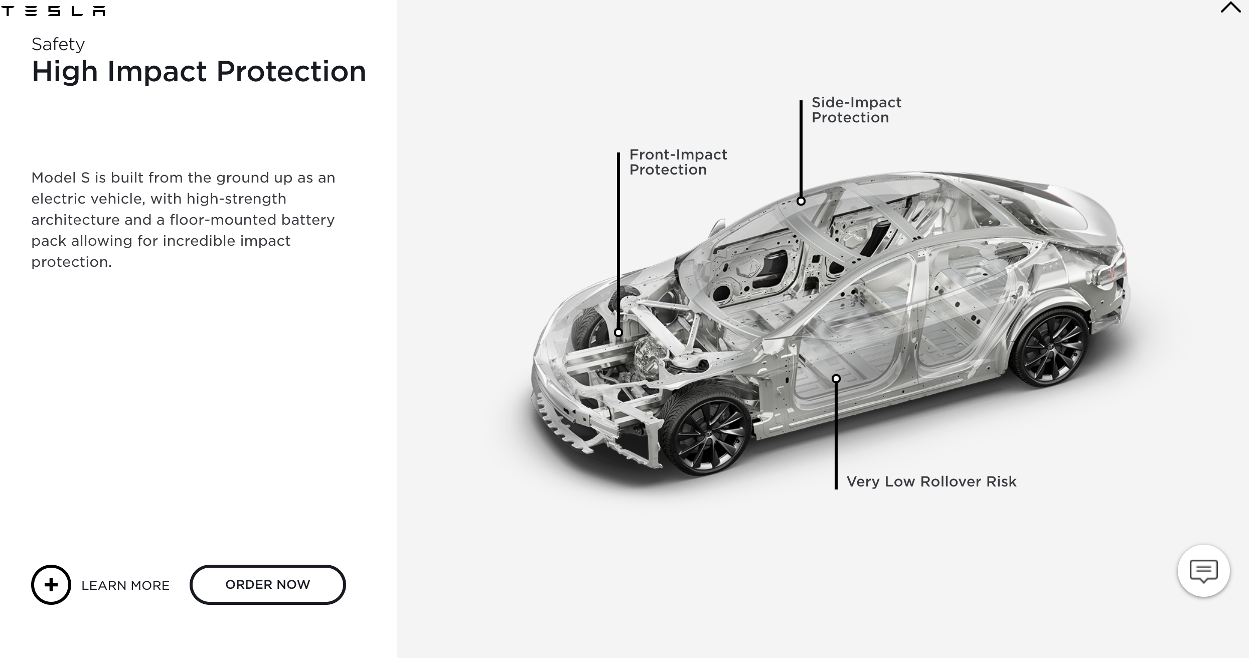
© TESLA.COM

© GUCCI.COM
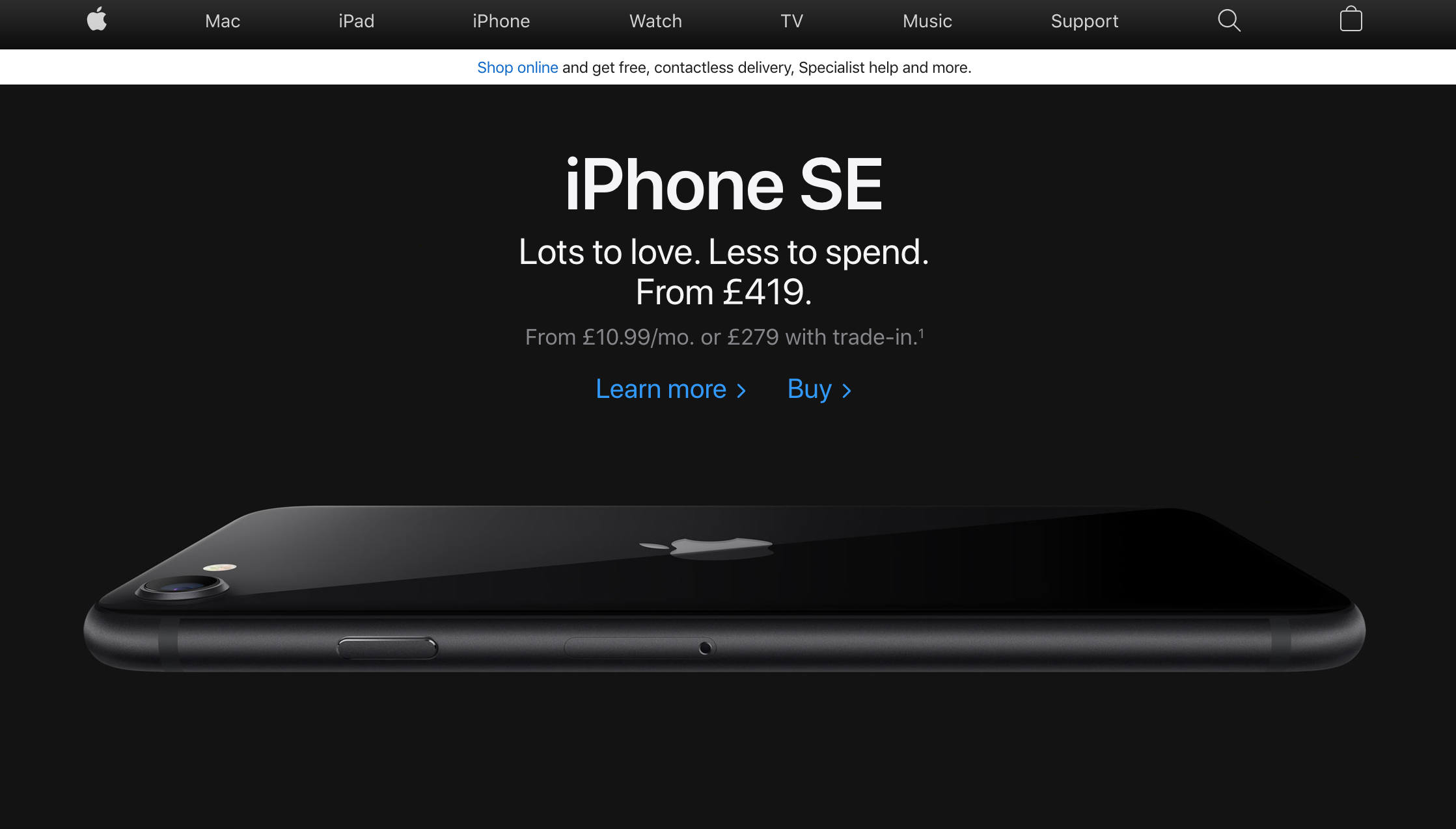
© APPLE.COM
The blank space is used as a separator between images, text and the all important CTA! The images and CTA buttons are kept to a reasonable size, and it's the spacers in between that create the beautiful impact of what's important on the page.
Content and white space balance
At Original box, we understand that as a business you want to create a website that includes as much information as possible. That the content must reflect the diverse range of products or services which your business may offer.
This may mean trying to include as much content as possible, but is not always the way which will lead visitors down the right pathway.
Enough white or blank space on a page, will help distribute the content in the correct manner.
It will do this in a way which makes the website look uncluttered, but at the same time offers less distractions to your site visitors who are then more likely to take the right actions (e.g. click the CTA buttons/links).

In the consumer’s head, more choice is better
The concept of presenting less choice to website visitors can be used to fill a completely different blog. But .. and to keep things brief for now, less choice in content is a fantastic way of ensuring your potential customers and clients only choose those links that are important to your site goals.
After choosing what is your core content (links, text, images), white space can be used to fill in spaces in-between. Keeping the page clean.
“ LOVE CHOICE? ”
There have been some psychology studies performed around the number of choices that are presented to people versus decisions made, or the lack of.
The purpose of using white/negative space is also centred around such psychology studies, which have shown that people love choice. However, this doesn’t bode too well for your website visitors that you want to convert into customers and eventually sales.
Think about this for yourself for just a few seconds. If at a market stall, and you come across a range of products ready for purchase, the more choice you’re given, the more you feel like you’re in control and may have a better basis for making a decision about which one to eventually buy.
Too much choice = no choice at all
In fact this is untrue, and the same studies have found that the less choice you’re presented with, the more of a probability that you’re likely to purchase a product.
This is because choosing from a small range of products compared with a larger range, means you as the consumer are less likely to suffer from something called ‘choice paralysis’ (check out our other blog post where we explain this).
This works the same way for your website visitors. The less they have to choose from on a given page, the less they are likely to become overwhelmed by the amount of choice available to them.

Imagine being in a store...
Who knew we could write this much about, well, literally blank space. However, negative space has multiple benefits and a wonderful way of creating harmony on a website.
It can help to produce a website which stays true to your site and business goals, as well as add sophistication and impeccable style.
able to breathe
Simply put, the use of blank space allows your content to be able to breathe. Imagine walking around a high end shop, crowded with clothes hung up on closely spaced racking.
You become frustrated because everywhere you walk you have to push past these clothes, and there is no way you’re able to properly take a look through the various styles of product, and cannot make a good choice.

However, as soon as you move this racking around a little, and add enough space for visitors to wander around in and observe without having to push past objects, this can take away the feeling of being confused.
The same concept can be applied to the content on a webpage. Allow enough blank space in between the various elements on a website, and visitors are less likely to become frustrated and annoyed due to a cluttered layout.