
How to introduce yourself on your website
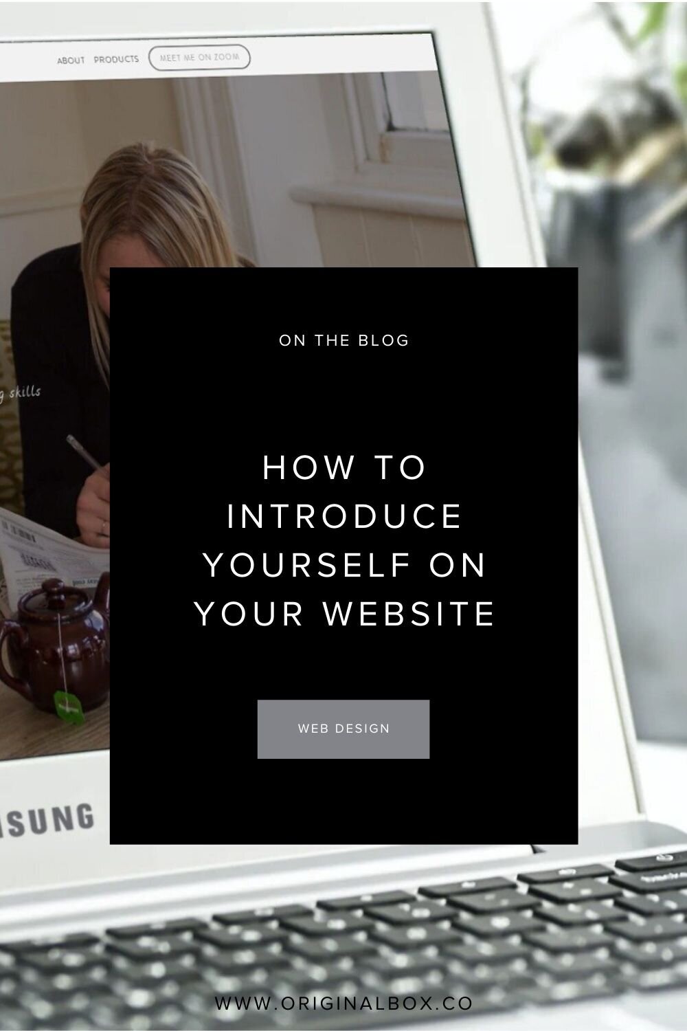
Let’s talk about how to introduce yourself and your business on your website, by which of course, we also mean your homepage. We’ll discuss how a minimalist website design can help create a beautiful homepage layout, with some great minimal web design examples shown below.
The homepage of your website is also the welcome page to your site, which means that it needs to contain the right content to quickly grab your visitor’s attention.
Think of it like a cover of a magazine; the welcome content for your website should get your ideal client type excited.
The Homepage
Your prospective client or customer is clicking onto this page and are immediately thinking to themselves - “why should I stay and open the other pages?”.
Just like the magazine cover analogy, the homepage does not need to contain a lot of information. In fact the last thing you want to do is clutter this page with irrelevant information, which will also put off your prospective paying customers.
There are 4 points you must include within your homepage:
Business/company logo
Primary navigation links; the most important links should go here
Photo(s) of your work/product, office or your team (whichever is relevant to your business)
The unique niche that your business falls under; what separates you from your competition?
Recent Project
For a boutique interior design studio, based in California, US

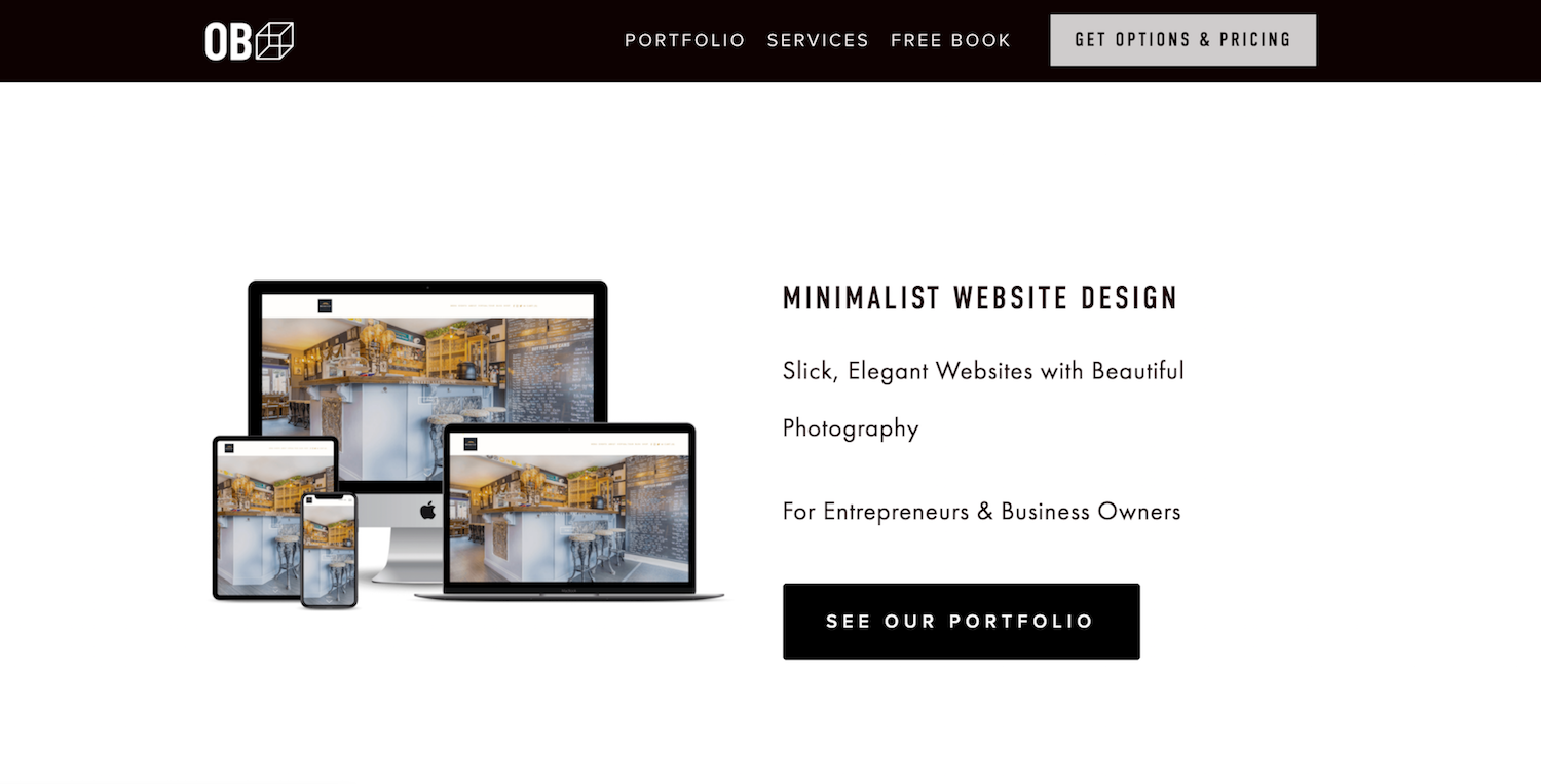
Example of Successful Homepages
Here is an example of one of the Original Box designs for an amazing local specialist alcohol shop. All of the above 4 points have been covered for this website.
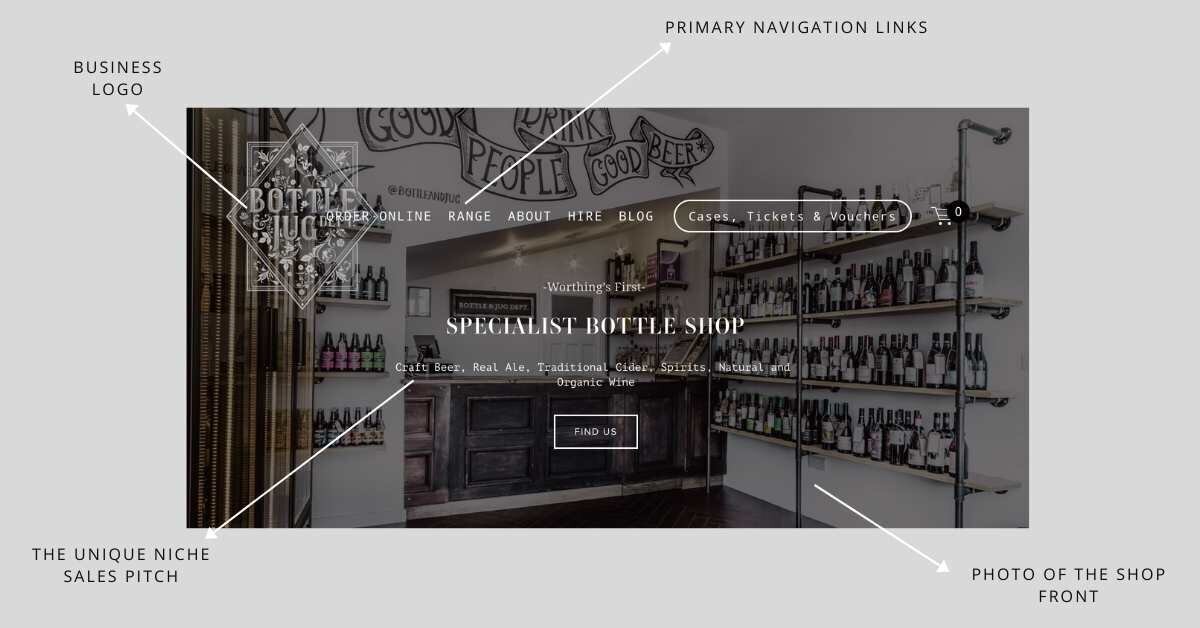
This is done using a minimal website design strategy, which illustrates the fact that the homepage is delivering all of the desired information but without cluttering the page.
Here is an example of a website by The London Essence Co.
This is also a great example of a website homepage that displays the company/business logo, primary navigation links, photo/animation of the product and, it identifies the niche that it is serving (customers who love high end, distilled drinks).
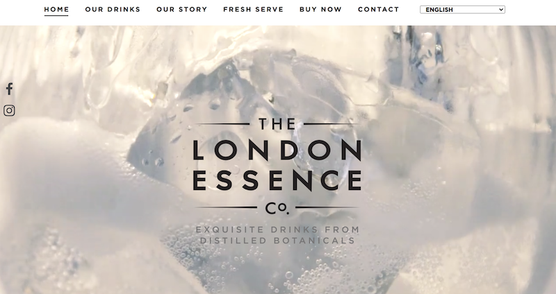
https://www.londonessenceco.com/en
Homepage Design
The homepage design should be split up into various sections if this is applicable to your business. Break the page into segments with only the core information displayed, for example, business location on Google Maps (if location based), business hours, testimonials, various services, etc.
The key is to ensure that you tell your prospective clientele how you are different. What is your unique niche and how are you making sure this is clear to your visitors?
Studies have shown that your website has 3 minutes at the most, to hook your ideal client in and get them to click on to other pages. Where visitors will only spend an average of a maximum of 8 seconds on your homepage before deciding to move on, or stay.
If you only have this brief period of time when they are doing their research on your business to convince them to stay, you want to make your unique sales pitch very clear!
It is estimated that in under these 8 seconds, approximately 50% of your site visitors will leave after only looking at the homepage. This means that for the total number of daily visitors, cut that number in half, and only this number may click on to view a second page.
In order for a good visitor - sales conversion rate, you want to make your homepage as clear and concise as possible. Too much irrelevant information will likely confuse visitors, leaving them unsure of where they need to go next and increase the chances of them leaving.
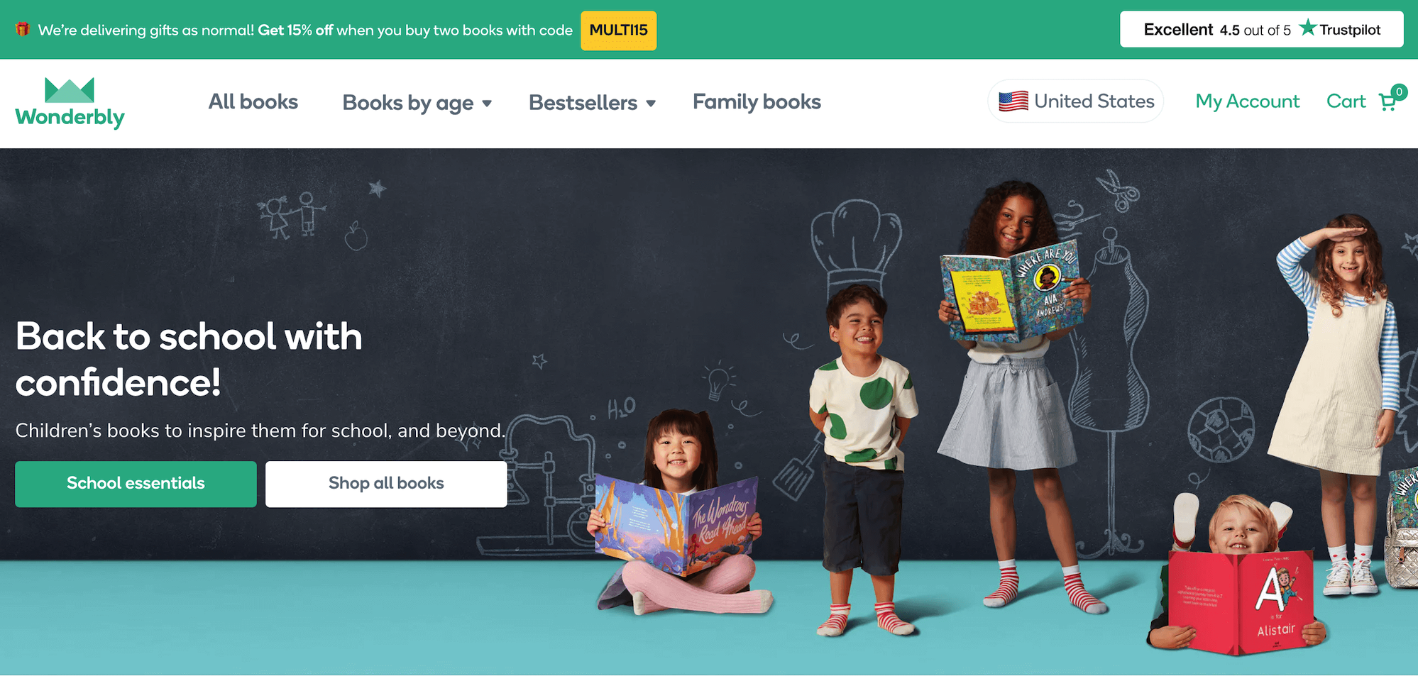
https://www.wonderbly.com/
Business Logo
You definitely want to show your company/business logo on your website homepage. Most likely your existing client base recognises you through use of this logo, and only makes you more identifiable. You should present this at the top left or top center of your homepage.
However, with respect to the other 3 points, the business logo is the least significant when it comes to visitor - sales conversion rates.
Logo Designs
Discussing the design of a business logo is an entirely different topic. However, the reason why this is the least important aspect of your homepage, is because the intention of this page is to grab your visitor’s attention through information on how you’re going to serve or provide your customer.
Remember that this page is not all about you, and you don’t want your logo to steal away the attention from say, photos of your product or the text describing your unique niche. This can be very much dependent on the design of your logo, where more complex looking logos should be kept in the background and definitely not become the centre of attention.
Some logos however, are kept very simple and minimal, and may just be text based such as Tiffany & Co., Gucci or The London Essence Co. (earlier example). For such cleaner designs, you can possibly afford to place this elsewhere on the page as this then also displays the company/business name.
Primary Navigation Links
These are the links to the most important pages on your website. Going back to the idea that you may only have 8 seconds to convince your website visitor to stay, you need to ensure that you only include the most significant pages along the top of your page.
If you’re a business providing design services, you want to make sure that your ‘Portfolio’ page is one of the first links that the visitor can see. As well as this, you want your visitor to see the ‘Services’ and most likely a link to where they can ‘Contact’ you.
Our other post on this topic - How many primary navigation links in minimal web design.
Example
Original Box is a website design company, and so these 3 aspects were core to our primary navigation bar, as shown below.
For those businesses offering intangible services, your primary navigation bar may look different. Such as making sure that a link to your ‘Team’ page is available instead of a portfolio page.
Whatever it is that your business offers, and whichever way you serve your audience, decide what it is you want your visitors to choose in order to become more engaged and ultimately make a decision to purchase your product or service.
Of course sometimes you can find alternative terms for the primary links, for example what we at Original Box have done. Instead of ‘Contact’ we have used ‘Get Options and Pricing’. However, keeping it as simple as possible is best, especially if you’re in any doubt.
Choice Paralysis
You don’t want to offer too many choices for your visitors on your primary navigation. The more you give them to choose from, the more they may become confused and overwhelmed.
We call this choice paralysis. You can apply this concept throughout your website, and with a minimalist strategy, the less choice you offer visitors the more effective your website becomes. People will always love choice, because then they feel like they’re in control.
However, in order to ensure your prospective clients choose only the most significant pages to look through, do not give them the option to choose less important pages within your primary navigation bar.
You always have the option to move these less important links, to the footer of your website. E.g. a link to your blog page.
Photos
One of the best things you can do is show a beautiful and professional photograph of your product, design work or even of your team, on your homepage. This is the first impression that you give to your website visitors.
The trick is not to clutter the page with lots of photographs, but rather choose a nice selection of between 1-5 of the best ones.
Depending on the industry that you’re serving, you will need to decide whether or not you want to invest in and show professional photographs, or whether you can get away with using stock photography. But stock photography should be used as a last resort and is not preferable.
For example, if you’re an interior designer, you would want to display your best work on the homepage and invest in professional photography, or atleast 1. However, if you’re a financial advisor, you would want to display a photo of your team, or at least of yourself if you don’t have one. Again, making sure you use your best photos.
Simplicity is Key
A minimalist design strategy is to keep the pages of your website as simple in layout as possible, whilst still delivering the most important content.
Displaying even 1 beautiful photo on the top of your homepage can speak volumes if done correctly, and it will mean that if your prospective clients are impressed enough they do not have to keep scrolling further down onto the page.
You don’t have to scroll very far down on the Apple.com website homepage in order to see the best images of their latest and best products on the market.

https://www.apple.com/
Remember that the idea is to get your visitors to click a link in the primary navigation bar as the next step, but if they’ve scrolled too far down then it may mean they forget to do this, or can’t be bothered to scroll all the way to the top again.
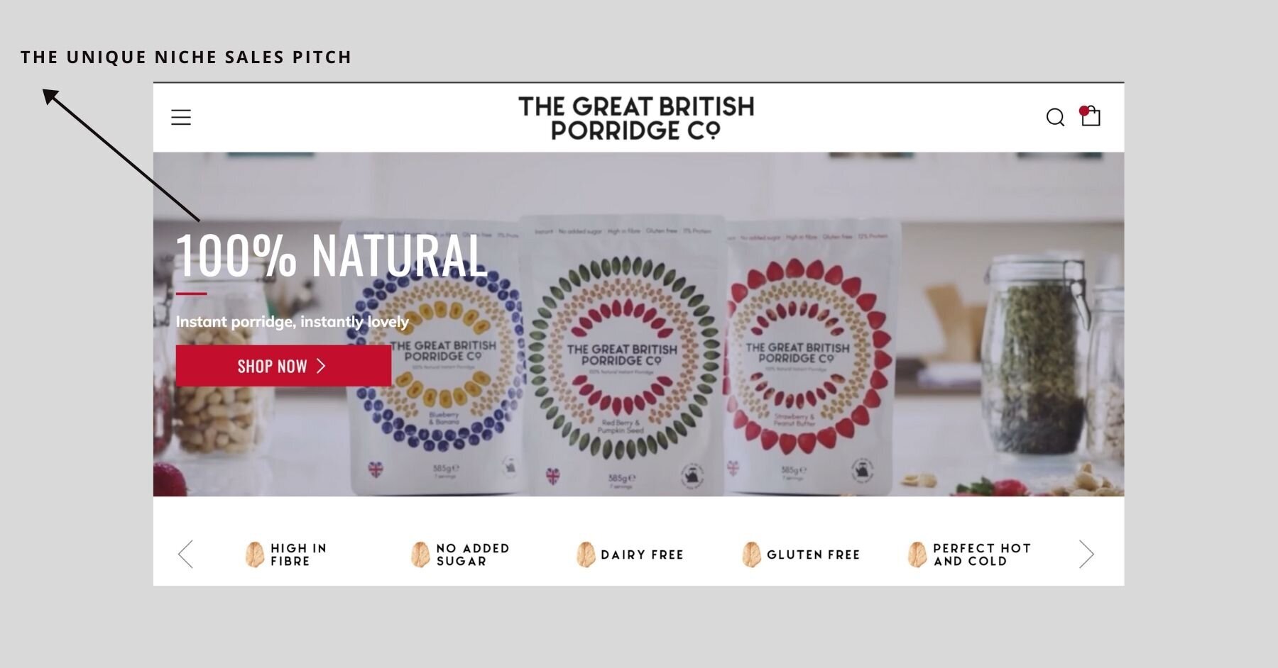
The Unique Niche Pitch
We have written a whole other blog post on this where we talk about the importance of, and how to create your own niche.
Your unique niche sales pitch is a statement that you have created, to describe the niche which your business falls under. This is the statement that you want to include on your homepage, and is the most important aspect.
The process of defining a niche is one of the most fundamental things you will do for your business. This is the stage at which you create a focus for the business, and hone down on which services or products you love most and, and which client type will really want what you are offering.
Example Time!
This is an example of a beautiful minimal website by Original Box for The Great British Porridge Co. In a few simple words, the website has stated what the business does and, the product will appeal to customers who love convenience (‘instant’) and natural foods. This unique niche is made very clear on the homepage.
Your prospective customers are potentially comparing your business with others, and more importantly they are looking for that 1 varying factor that makes your business different from the rest.
If there is no defined difference between yours and another business, then your customers will base their final decision mostly on price or another convenience.
However, if you can clearly define how your business will serve your customers in a way that another cannot, this could make the difference between a sale or a customer choosing to go elsewhere.