
Best Squarespace font pairings for minimalist sites

It can be daunting working out what the best Squarespace font pairings are, when designing a beautiful and minimal website. You want to choose well to represent your business, and the type of font can make or break your design.
There are some really nice minimalist web design fonts to choose from on Squarespace.
In this blog post we take you through and list some of our favourite web design fonts that are nice and clean in design, as well as how to change and edit your fonts on Squarespace when it comes to designing your site.
In minimal design, choosing the right site styles is crucial. You only have about 8 seconds to make a positive impact on your visitors! You want to choose font styles that speak out to your ideal clients and compliment the colours and images on the site really well.
However, it isn’t just enough in choosing the right font, but you need to pair the fonts well too. For example, when using Squarespace version 7.0, you can change the fonts for 4 different headings/body text. These are H1 (heading 1), H2 (heading 2), H3 (heading 3) and the body text or paragraph.

Squarespace Site Styles; font pairings
Choosing your Font
You want to choose a font style that won’t become dated in the near future, and so choosing something classic and elegant is the goal in minimal website design strategies.
For example, and as much as it hurts us to say .. once upon a time the Comic Sans font was popularly used on websites, but let’s hope businesses are steering clear from it now!

Best Squarespace Font Pairings
We have listed some combination ideas below for you, and have given some ideas as to when to use them and for what type of business or industry.
The following are well designed to be used as headers and subheaders on your page.
These are merely suggestions for your website design, and by no means are hard and fast rules. But … when it comes to choosing, we encourage you to think about it well and maybe do some research on search engines such as Pinterest. This is a great tool for font ideas!
MONTSERRAT
This font is really versatile and good for use as headers and subheaders, and is a nice one for more urban designs. It can also be used in more elegant site layouts.
Although the traditional look of the font is great for traditional sites, but because of its well rounded corners is also suited for modern websites.
Pairing well with Vidaloka and Lora fonts.

Best Squarespace font pairings
PLAYFAIR DISPLAY
This font is a serif typeface and is designed as a display font with a more traditional look. It’s best used as a header display in more traditional or classic looking websites.
Pairing well with Open Sans fonts.

Best Squarespace font pairings
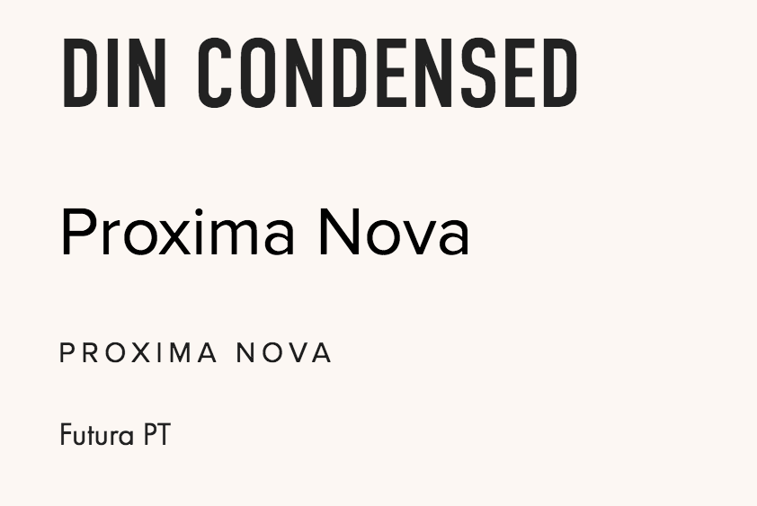
DIN CONDENSED
This is a good font for headers, with quite a bold statement. This font type is great for very minimal designs, and when surrounded by plenty of white (or blank) space. Use it well and in clean website layouts.
Pairing well with Proxima Nova, Futura PT and Heebo fonts.
Best Squarespace font pairings
GOOD HEADLINE PRO CONDENSED
This font is great paired with Adelle Sans such as below.

Best Squarespace font pairings
BITTER
This is a contemporary font, especially designed to be read on any device. Use this on more modern website designs and pair it with Adelle Sans.

Best Squarespace font pairings
Minimal Website Design Strategy
You need to change and set the fonts and their best pairings earlier on in the design process. In fact, do this right from the beginning. If you leave this too late, you’ll be basing the rest of the design on font styles you’re not yet sure of!
Also, if you leave setting the font styles too late in the design process, it might come out to be inconsistent and a bit more painful to keep editing later on.
A minimalist website layout (see the link to our free design strategy workbook below) means less clutter, reduced text, imagery and graphics on the site’s pages. (Even the number of pages should be kept to a minimum). So, with the little content you do have … stick to font pairings and colours which make a strong impact to visitors and your ideal clientele.
How to Design your Fonts on Squarespace 7.0
Squarespace version 7.0 is still around and will be for a while. This is for those people and businesses that have obviously built their current websites using it, and for those that prefer to keep using it.
This version enables you to set the fonts for H1, H2, H3, body text, and also the text within links and buttons.
It's all in the Site Styles under the Design section!

Squarespace; Design
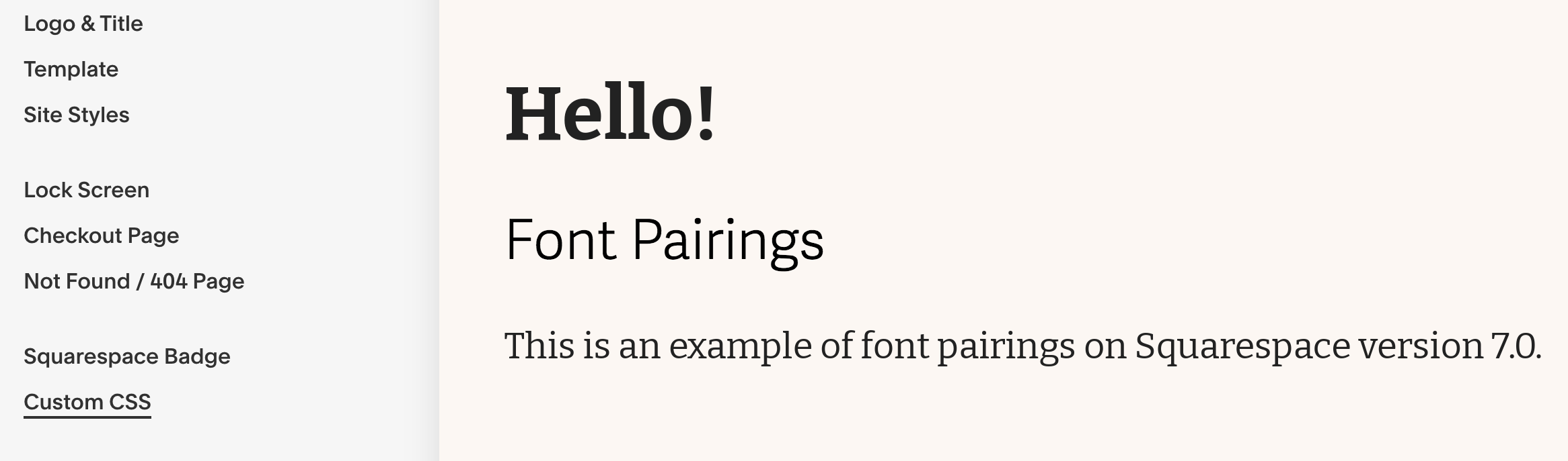
Head into Site Styles and select the text (H1, H2, H3 or the body text) that you want to change. As soon as you do this you will see the blue square around what you have selected, and the content’s default font style and colour along the left hand side bar will appear, which you can now edit.

Squarespace; Site styles
Click on the drop down box as we have demonstrated below and you will get the options to:
Change the font
Change the font’s weighting
Change the font’s size
As well as other aspects which we won’t go into in this post.

Best Squarespace font pairings
How to Add Custom Font
It is entirely possible to add your own custom font!
The code to use is shown below, where for Squarespace 7.0 you can do this for 4 different headings/paragraphs (as mentioned above):
@font-face {
font-family: ‘YOURFONT’;
src: url(),
url(),
url();
}
h1 {
font-family: 'YOURFONT';
}
…… And so on for h2, h3, and using ‘p’ for the body text.
The codes need to be added into the Custom CSS section in Design, as shown by the below image.
First and foremost, upload your font file(s) by clicking ‘Manage Custom Files’. The font files will end with OTF, WOFF or TTF.
Now, replace the term YOURFONT with the name of the font type, keeping consistent in both codes. Then add the uploaded urls of your font files in between the brackets.
Squarespace; Custom CSS

Squarespace; Custom CSS
Compare and Contrast
It is important to choose pairings that are not too similar in their look. For example, choose one serif type font and one sans-serif type. However if the two or three chosen are in the same category, play with the thicknesses of one of them, making one heavier than the other.
Again, you can do all of this within Site Styles in the Design section.
The idea is to make sure they pair well, but to have contrast and making sure they don’t look identical.