
8 Squarespace portfolio examples
We’ve gone ahead and done it again! Showcasing real life websites which we’ve found online and loved. This time we have 8 portfolio website examples designed on Squarespace (of course), and we’ll also explain why we’ve chosen these specifically. These examples will be of interest to photographers, artists and designers, and all those creators who require a portfolio to showcase their work.
We were looking for some core design aspects like an informative homepage, a portfolio made up of varying categories, beautiful imagery or photography, a good about page and a contact page.
The purpose of a portfolio is to build a connection with your future clients and the audience who come to see your work. You might be asking, “well what about conversions?”. Conversions are important too, of course, however, people are more likely to want to work with you, or buy from you, once they’ve built that emotional connection in the first place.
Portfolio Examples
These are real life examples of websites built on Squarespace, that we found online. They came across as quite striking and we've also chosen them because at Original Box, we really love minimalist design.
And when it's done, right, it just looks so beautiful and it really showcases creators' work so beautifully. And so what we're going to do is go through some real life examples below.
Disclaimer: The following designs are not ours and we take NO credit for them! They are just examples that we’ve found and loved from Google searches.
Design Refinery
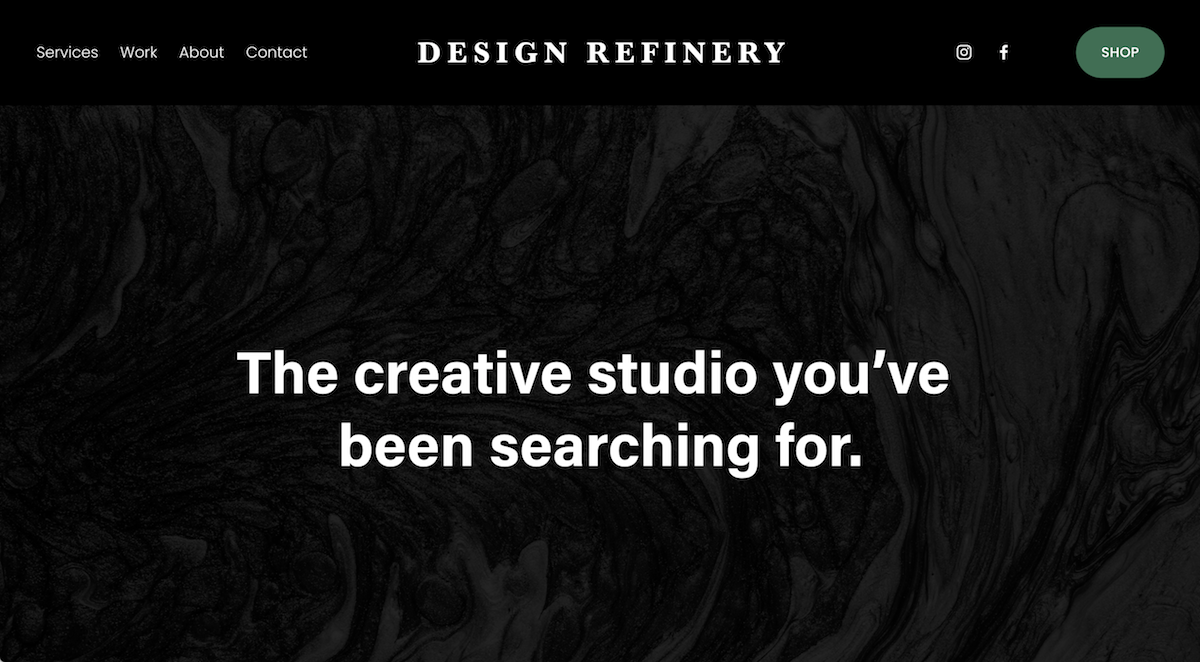
What I really liked about Design Refinery is that the tagline stands out before everything else. This is the first thing that I see. And it instantly tells me what it is that I should expect from this business. That they're going to create something for me, something like graphics, branding or websites.
As I head over to the main navigation, I can see that they don't have a Portfolio page per se, but they've split it out between Services and Work. This follows the user journey they want you to follow, because the next page is the Contact page. I mean, it's as simple as that and it doesn't need to be anything more complicated.
The design should be striking to your ideal client, the person that you dream of working with, the “dream client”. This is who the website and the branding is made for, and it should instantly strike out to them.
2. Iosif Sainiuc

What I do love about this website is I can instantly see it’s for a photographer. The homepage is a slideshow of images of their best work.
Splitting your projects or portfolio page up into the various projects that you want to showcase, especially for photographers, is a fantastic way of giving people the option of what they want to view.
The website is super minimal in layout, and with minimal copy, letting the photography do the talking. The main navigation also follows a super simple user journey, with the end goal of sending visitors to the Prints page so that they can make a purchase.
3. Erin Ruffino

This is an artist's website. And what I love again is they've provided a slideshow of their work, on the homepage.
The copy instantly tells me that the artist sells their art on prints. They’ve included their portfolio into Work on the main navigation, and the user journey is once again, super simple.
The branding is not overpowering their work. This is one thing you will notice with portfolio websites, you do not want an overwhelming colour palette which masks your work and what you have to offer.
4. Domineré Evans

The first thing I see is a beautiful photo on the homepage. As I scroll further down, I see a call to action to go straight to the print store. So I know this person is a photographer and they are selling their prints. It's super simple.
Also, the ‘about’ section is at the bottom of the homepage, and this is another option. If you do not want an entire page dedicated to this, you can just have a section on the bottom of your homepage.
And then there's a contact page. We love contact pages and specifically we love contact forms! This is because you’re making it super simple for people to get in touch, and you can ask your potential clients some questions beforehand, to help you better understand what they might need!
5. Carla Bonnet

This is for a wedding and elopement photographer. The way that's laid out is so simple. The tagline tells me exactly what they do and who it's for!
I love the quirky GIF image which is placed right in between the tagline, it’s different and beautifully displays the website’s personality. There's also something so timeless & elegant about this color palette.
Once again the portfolio is displayed, but as ‘Stories’. You don’t have to stick to a standard copy/description, however, as long as you make it super clear to your visitor what they’re about to click on to.
6. Studio 500Gram
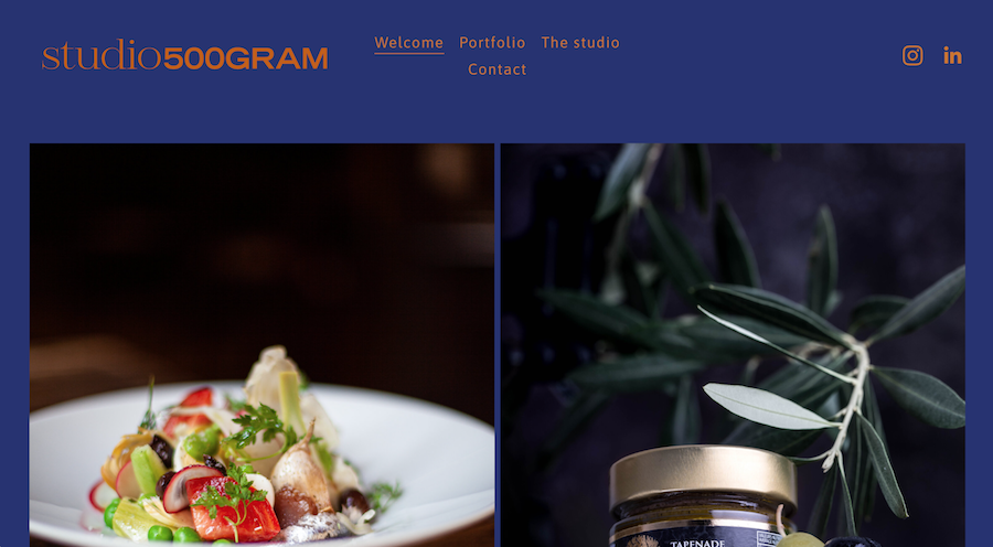
What I really liked about this website is that I can quickly see that it's all about food photography! As you scroll down and you'll see the first bit of copy, which basically tells the visitor what the studio does.
As you scroll down and you'll see the first bit of copy, which basically describes what the studio does and who for. The first call to action is to get in touch with them. The copy that you use is so important, because it's such a good route to building a good connection.
7. S3 Design

This is an architecture, interior design and planning studio. This is such a great tagline because they are quickly telling you who they are and who they're for.
I also love that it's a very short homepage. With a beautiful slideshow of their previous work. And there are two calls to actions, which are 'About Us’ & ‘Project’. The user journey is made very clear.
8. Asher Gardner Photography
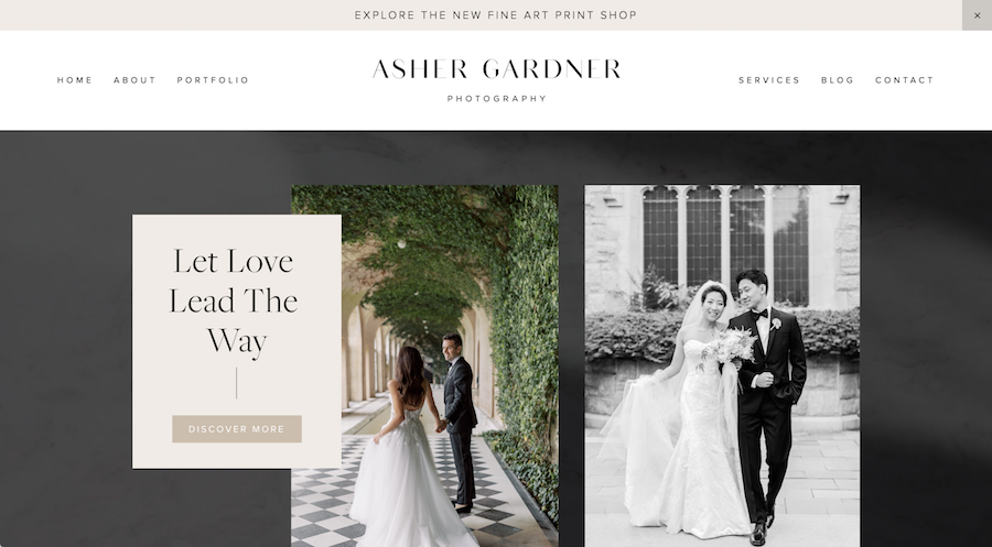
I really like the tagline, and then the first call to action is to ‘Discover More’, where I can see some of their previous projects. And this is showing me the experience that I'll get when I work with this photographer.
As well as following the checklist for a great portfolio website, the design is super minimal too. I love the subtle shapes and shadows used in the background. And this really gives the website a great edge. Makes it a lot more striking, and really makes the photography pop.
I love her video banner. This is so cool because it shows the wedding photographer in action. It shows her working with couples in cities, parks and other venues and therefore gives me a picture and vision for what she can achieve for me, and what I should expect. Videos are also a great way to keep your site visitor on the page longer …. which is ultimately good for your site’s SEO!
What I love about her contact form is that it's not just a simple one asking for, ‘your name’, ‘last name’, ‘email message’. She has asked for some specifics like, ‘what venue you're looking for?’, ‘what dates are you looking for?’, ‘what is your estimated budget?’. Because when the photographer gets this information, they already have a whole load of information that they can use when contacting the enquiring party.
So, what I like is that the website is doing a bulk of the initial admin work, in that it is collecting information for you, and all you then have to do is start compiling that information. Make your website work for you and not the other way around. That is what a website is meant to do. It is your virtual assistant. So use it well.